Wednesday 19 December 2012

ROUGH CUT 2


This is our second rough cut.  We removed a couple of clips that received negative feedback from our target audience such as  the second time the person appears from the the phone box.  Also, when watching the trailer back, we realised we hadn't removed the audio from the clip at 0:51 so this will have to be corrected for rough cut 3.

Feedback:
  • Didn't understand the relevence of the car - 18 year old
  • The titles at the end don't look very professional - 30 year old
  • I really liked the punch and the man on the floor - 18 year old
Lauren Tween & Amy Bowman

Tuesday 11 December 2012

ROUGH CUT 1


This is our first rough cut for our soap opera 'Cherry Gardens'.
Here is some feedback from members of our target audience (16-60 years):
  • Music is too church like - female, 17
  • Add some colour effects onto clips to make it more interesting - male, 45
  • The second phone box clip does not make sense - female, 33
  • Clip of mature female does not fit with other as it has been sped up - female, 16
  • Really like the music - male, 18
  • I think the storyline of the trailer is very clever - female, 47
  • I found it exciting and gripping - female, 42
  • I think the punch and the noise that goes with it is effective - female, 32
  • Nice variety of characters shown - male, 23 
  • Its melodramatic which makes it enticing - male, 18
  • Music maybe too over the top - felmale, 17
  • I think the music is really suitable - female, 18
-Amy Bowman & Lauren Tween

Monday 10 December 2012

FINAL LOCATIONS

After much consideration, these are the final locations that we decided we would like to use within and film for our soap opera trailer.

Exterior of church:
We felt this scenic Church would be an ideal opening shot for our trailer. We hope that by using it right away, it should establish a traditional, village feel for the audience, and therefore familiarising them with our rural setting we've chosen.


White houses:
A common convention of soaps is to have a road that most the characters live down, we decided that this set of original looking houses, would be our main domestic focus within our soap opera. We chose these houses as they look quite close-knit with each other, which could reflect in the relationships of whose who live in the road. This theme can echo throughout the rest of the soap, conveying to the audience the strong community cohesion the residents of the village have.


Semi detached houses and village green:
Inhabitants of the village, would also live in these semi detached houses.
We used the village green within the trailer, as we thought it was an effective soap setting. In an episode it would provide a social area, being a place for characters to meet.


The Windmill Pub:
We decided to use a pub within our trailer, as it's a common and successful convention of soap operas. By having this pub in our trailer, we show the centre of the community, and a place that would become so prominent in actual soap episodes. We chose this location to film in, as we had permission to film inside and on the outside grounds of the pub.


Quiet road:
We needed a place for our youths to run away from the camera in our trailer, we decided that this very quiet road which is a way out of the village would be appropriate.
It being quite an empty and quiet area, it adds to the sinister feel of the punch scene, makes you worry about the hurt male, and if anyone will find him.


-Amy Bowman

Saturday 8 December 2012

FINAL PROPS

Below are some of our final props:

Chair and Book

By using a chair in our trailer, we displayed to the audience a domestic view of what the actual soap episode would look like if we were to create a full soap.
The chair also conveys to the audience the importance and authority the character sat in the chair has, to own have her own chair which others are not allowed to sit in.
The book the character is holding, connotes to the audience the intelligence the character has and her wide knowledge of life.


Pub bench and beer

These props help build certain scenes within the trailer by connoting that the characters are outside a pub drinking, this is to make it easier for viewers to associate them being at the pub without showing the pub logo or establishment name. By showing a pub in our trailer an characters drinking together, we displays to the audience a sense of togetherness and community within the village.


Dog

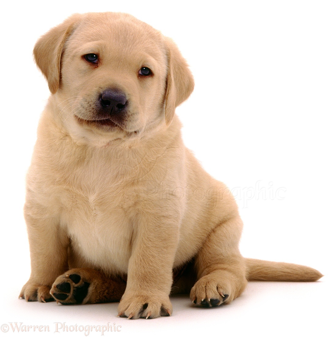
The dog we used was a Labrador, when done this to connote that the youths were trying to be someone they're not and that it was their own choice to turn out; they weren't brought up that way. The dog breed 'staf' is stereotypically associated with "chavs" (council house and violence), and we didn't want to stereotype this much so we decided to use a different breed.
Although the dog gave our trailer a good outcome, it was quite ambitious of us to try and work an animal, so unlike humans, they do not take direction well.


- Jordan Kenneally, Amy Bowman

Friday 7 December 2012

FINAL COSTUMES POST

We are only showing the following characters (and some extras) in our soap opera trailer and therefore we didn't need to organise costumes for every soap character:
  • Dan & Kirk
Original costume idea
Photobucket

These are the costumes we put together for our stereotypical 'chav' characters, Dan and Kirk.  We wanted them both to be wearing hoodies as this is conventional of the character type and connotes youth.  In the present era, hoodies are symbolic of unrest, violence and fear within society which connotes to the audience these characters' tendencies and unsettled personalities.
  • Dom Morris
Original costume idea

Photobucket
(left to right) Dom Morris & extra

Our costume for Dom changed slightly from his original costume.  Originally, we were going to show Dom working in our trailer, hence the stained hoodie.  However before filming, we decided we felt it more appropriate to show him socialising, as a way of cleverly incorporating the outside of his Dad, Marris', pub into our trailer.  Instead of being in his work clothing he is in a casual jumper to have drinks with a friend connoting he is at ease and hasn't yet heard about, or isn't worried about, his father's situation.
  • Marris Morris
Original costume idea

We kept Marris' costume the same, but added a jacket as it made more sense when filming outside for him to be wearing something warmer to ensure we remained verisimilitude to everyday life; as people wouldn't go outside without a coat or warmer clothing during winter.
  • Beryl Clark
Original costume idea

Beryl's costume we changed slightly as we felt having her in a nightie would make her seem less respectable.  As she's supposed to be wise and bearing knowledge we felt her costume needed to be less humiliating and demeaning.  We kept the pink colour scheme but had her wearing a t-shirt and cosy jumper instead.  The glasses have connotations of wisdom; often being worn by 'nerd' character types in media texts. 

-Lauren Tween

Thursday 6 December 2012

POSTER LAYOUT IDEAS 5 & 6


 This is my first poster layout idea.  Conventionally, the poster must include what time the soap is on, what it is called and what channel the audience can watch it on.  I ensured I included all these things.  I like our slogan "It's not always sweet in Cherry Gardens" so I have chosen to use it on both my poster ideas - I think it is memorable and will draw the audience in.  My two ideas are very sinister also; displaying the storyline shown in our trailer where Marris is challenged by Dan and Kirk.  I did this so the audience can easily link these two texts together.  Being a new soap, if we were to use different characters that haven't been introduced through the trailer on the poster, the audience may not realise the two pieces were related and promoting the same new soap opera.  This poster is to be very dark and sinister.  The background will be shadowy and grey/black in colour, connoting horror and dark happenings.  The slogan and title of the soap opera will be in a bright red in contrast to the background and conveniently matching the Channel Five logo, again connoting death, blood and horror.  Hopefully this will interest people into watching the soap to find out what happens.

 
This poster has a portrait layout - unlike my other design.  I wanted it to be striking and capture the viewers attention at first glance which is why the image is quite disturbing.  Hopefully, this shock-factor would make the audience tune in to watch the soap.  I have only included 3 characters on this poster as these are the focus of our trailer so the audience will be able to link the texts easily.  This poster will show more of the soap scenery in the background; with houses from Cherry Gardens in the shot.  Again I have used our verbal slogan on the poster as I think it outlines the content of our soap opera in a nutshell.
 
-Lauren Tween

Wednesday 5 December 2012

PLAN FOR POSTER 3 & 4

Photobucket
My plan for our Cherry Gardens soap opera poster includes all the verbal information needed for a viewer to know where and when the soap is on so they can to watch it. Visual information conveyed includes some of the characters they will be introduced to if they were to watch the soap. The main character in the poster is Marris Morris laying in the foreground, depicted as he is in our trailer, this would therefore link the two media products together. Displaying the name of our soap is the street sign that we also see in the trailer, i thought this was a clever way to show the name, as it also reaffirms the point that it is set in an ordinary street. It shows the audience some houses that will feature in the soap if they were to watch it, therefore familiarising them with the soap surroundings.
The poster will include the natural colours the pictures were originally taken in, backing up our aim for verisimilitude. The weather in the poster will  be bright and sunny which contrasts with the image of the man in pain. By not using pathetic fallacy, we hope to intrigue our audience, it also backs up our tag line for the soap "Things are not as sweet as it seems in Cherry Gardens".
Attention will be gained in this poster by the image of the man on the pavement, once the poster has your attention, the many other characters in the background will start to become apparent. The audience can then start to piece what they see together, and they could interpret it in many way,  such as a who done it scenario.           

Photobucket
My second idea for a promotional poster is very different to my first, it's more to the point and more revealing in terms of the soap story line. Once again, as with the first idea, verbally it displays all the information needed to know where and when to find it, so you can watch it. On this poster i have added a verbal slogan 'Behind you'. This slogan backs up the visual side of the poster, gives something for the audience to consider and adds drama to the poster.
The visual side of the poster, has less details then the last, but i believe it has more impact. Whereas the last poster was one big picture with a lot in the background, this one does not has a background, it would be plain black, as black is usually linked with negative connotations. By doing this, the three characters and dog within the poster will stand out even more against the darkness. The characters will be quite big on the page, as its the emotions on the characters faces which is key to the audience understanding the story line which is conveyed by the poster. In terms of colours, the pictures will be the normal colours they were taken in, to suggest verisimilitude. The slogan will be in red as this will look really striking against the black background, red also had connotations linked to violence.
Attention is gained in this poster by the slogan and the concerned look on the character in the foregrounds face. From this poster, audience members could try and guess what the story line would be, as there is a lot that is revealed but not too much that it makes you not want to watch the soap.


 - Amy Bowman

Tuesday 4 December 2012

MAGAZINE AND POSTER PHOTOGRAPHS

For both our poster and magazine front cover, we will need pictures to fill up the page and to make it realistic to existing media products. Below are some picture that we have taken and found that we think may be suitable for these products.


Photobucket


PhotobucketPhotobucket


-Lauren Tween, Amy Bowman and Jordan Kenneally